

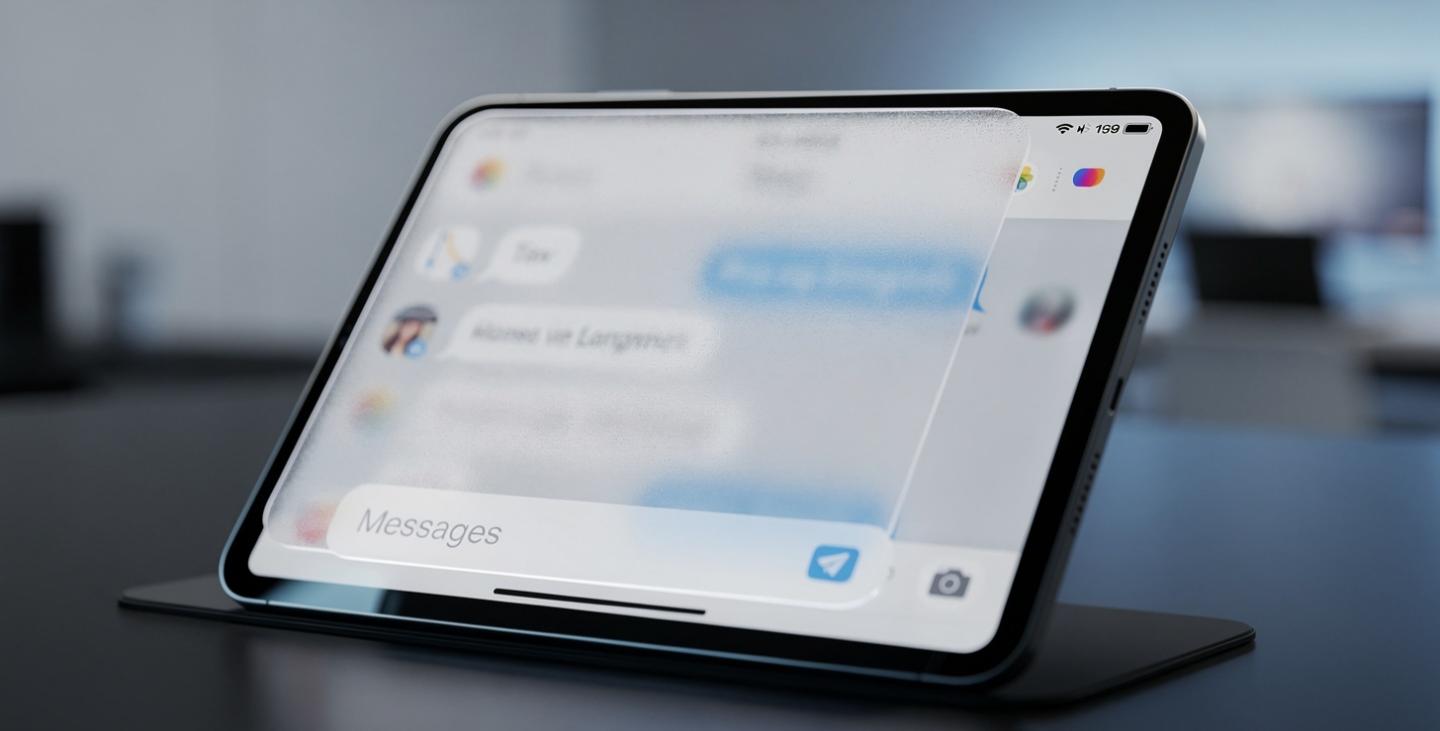
For months, iPhone users have been enjoying WhatsApp’s sleek, glass-inspired interface, while iPad owners were left waiting on the sidelines with the older, flatter design. That wait appears to be ending. The WhatsApp Liquid Glass design is now showing up for a limited group of beta testers on iPadOS, bringing the tablet experience much closer in line with what iPhone users have had since earlier this year.
Thank you for reading this post, don't forget to subscribe!This update is one of the most visible visual overhauls WhatsApp has rolled out in recent memory, and it signals that Meta is steadily working through its plan to bring a consistent look across every Apple device — iPhone, iPad, and eventually Mac.
What Exactly Is the WhatsApp Liquid Glass design?
TheWhatsApp Liquid Glass design language originated from Apple’s broader visual direction introduced with iOS 26, emphasizing translucency, depth, and fluid motion across app interfaces. Apple encouraged third-party developers to adopt this aesthetic, and WhatsApp has been gradually integrating it across its apps ever since.
On iPhone, this meant a floating tab bar, frosted buttons, and a navigation bar that becomes more transparent as users scroll through their chat list. Now, the same visual language is making its way to the WhatsApp Liquid Glass design on iPad, giving the tablet app a fresh, modern feel that finally matches its phone counterpart.
What’s Changing on iPad
According to beta tracking platform WABetaInfo, the most noticeable update is the bottom tab bar. Instead of sitting flush against the bottom edge of the screen as a solid strip, it now floats above the interface as a semi-transparent, glass-like element. This single change instantly gives the app a lighter, more modern appearance.
The top navigation bar has also been redesigned to respond dynamically to scrolling. As users scroll through their chat list, the bar gradually becomes more transparent, allowing the content underneath to show through — a subtle but effective visual touch that adds a sense of depth to the interface.
Buttons and context menus throughout the app have also picked up the frosted-glass treatment, complete with smoother, fluid animations whenever users tap or interact with them. Interestingly, unlike the iPhone version, the iPad’s tab bar icons currently do not include text labels underneath them, a difference likely tied to how tablet screens handle space and touch interaction compared to phones.
Why the Delay Between iPhone and iPad?
WhatsApp runs on the same core codebase across iPhone, iPad, and Mac, but new features and design updates are typically tested and released in stages rather than all at once. This staggered rollout approach allows the development team to monitor performance, gather feedback, and fix bugs on one platform before expanding to the next.
Since the WhatsApp Liquid Glass design had already been refined on iPhone for several months, the foundation was largely in place before adapting it for the iPad’s larger screen and different navigation patterns. This explains why iPad users had to wait considerably longer than iPhone users to see the same visual refresh.
Limited Rollout, Wider Access Expected Soon
As of now, access to the new interface remains limited to a small number of beta testers, with reports suggesting that a handful of users on the stable version of the app may also be seeing early signs of the change. WhatsApp Liquid Glass design has not announced an official date for a full public rollout, but based on how previous updates have unfolded on iPhone, broader access is expected to expand gradually over the coming weeks.
This cautious approach is fairly typical for WhatsApp, given its enormous global user base. Even small interface changes are rolled out carefully to avoid widespread bugs or negative user feedback before a feature is considered stable enough for everyone.
How This Fits Into WhatsApp’s Bigger Redesign Plan
The arrival of the WhatsApp Liquid Glass design on iPad is part of a much larger visual overhaul that Meta has been working on across all Apple platforms. On Mac, WhatsApp has already been testing a similar redesign, which includes a refreshed sidebar with text labels next to icons, an updated chat input bar, a new attachment menu, and a dedicated section for locked chats.
Meanwhile, on iPhone, WhatsApp continues to push the WhatsApp Liquid Glass design aesthetic even further, recently extending the translucent style to the in-chat bar and navigation bar within individual conversations. These refinements are currently available to some iPhone users but have not yet made their way to iPad, meaning a noticeable gap between the two platforms still exists even after this latest update.
What This Means for Users
For iPad users, this redesign is a welcome step toward making better use of the device’s larger display. Floating elements and adaptive transparency are design choices that tend to work especially well on bigger screens, where there’s more room for visual depth without making the interface feel cluttered.
From a broader perspective, design refreshes like this also serve a competitive purpose. As messaging apps continue to evolve, a clean, modern interface helps keep users engaged in an increasingly crowded market of communication platforms. Visual consistency across devices can also improve the overall user experience for people who frequently switch between their iPhone, iPad, and Mac throughout the day.
That said, not every user may welcome the change immediately. Some people have noted that frosted, semi-transparent elements can occasionally feel distracting depending on lighting conditions or the content displayed behind them. As with most design overhauls, the visual response is mixed for a portion of long-time users, even when the underlying redesign is technically polished.
Read Also: Infinix Note 30 Review: Surprisingly Powerful and an Unbeatable Budget Pick in 2026
What Comes Next WhatsApp Liquid Glass design
WhatsApp has not detailed an official timeline for when the redesign will reach all iPad users, but the company’s recent pattern suggests broader access will roll out steadily rather than all at once. As Meta continues refining the WhatsApp Liquid Glass design interface across iPhone, iPad, and eventually Mac, the goal appears clear: a single, consistent visual identity across every Apple device running WhatsApp.
For now, beta testers on iPadOS are getting their first proper look at what the rest of the WhatsApp community has experienced for months. As the WhatsApp Liquid Glass design continues to expand, it marks another step in Meta’s broader effort to modernize one of the world’s most widely used messaging platforms.
You can follow ongoing updates on this rollout through trusted beta-tracking sources such as WABetaInfo and Apple-focused outlets like 9to5Mac, both of which closely monitor WhatsApp’s beta builds for new design changes.